Refocusing on member needs
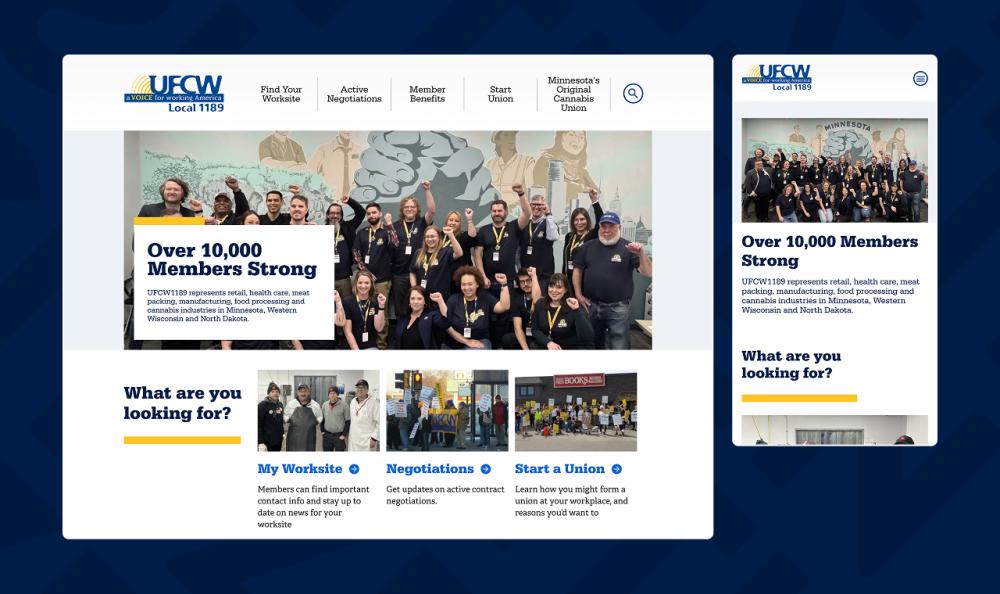
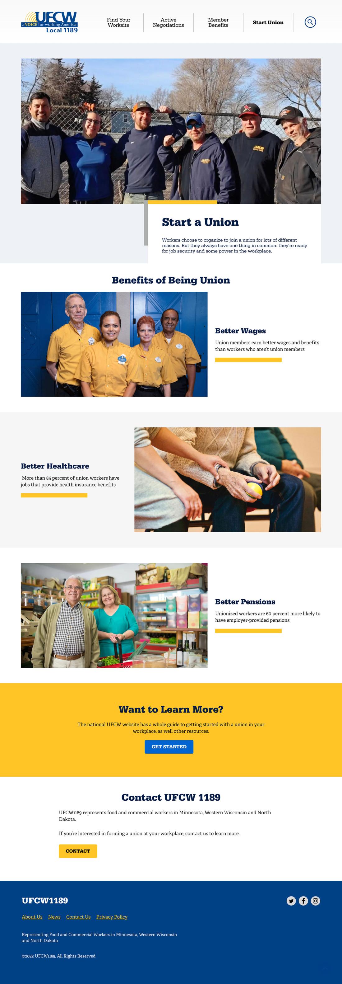
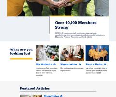
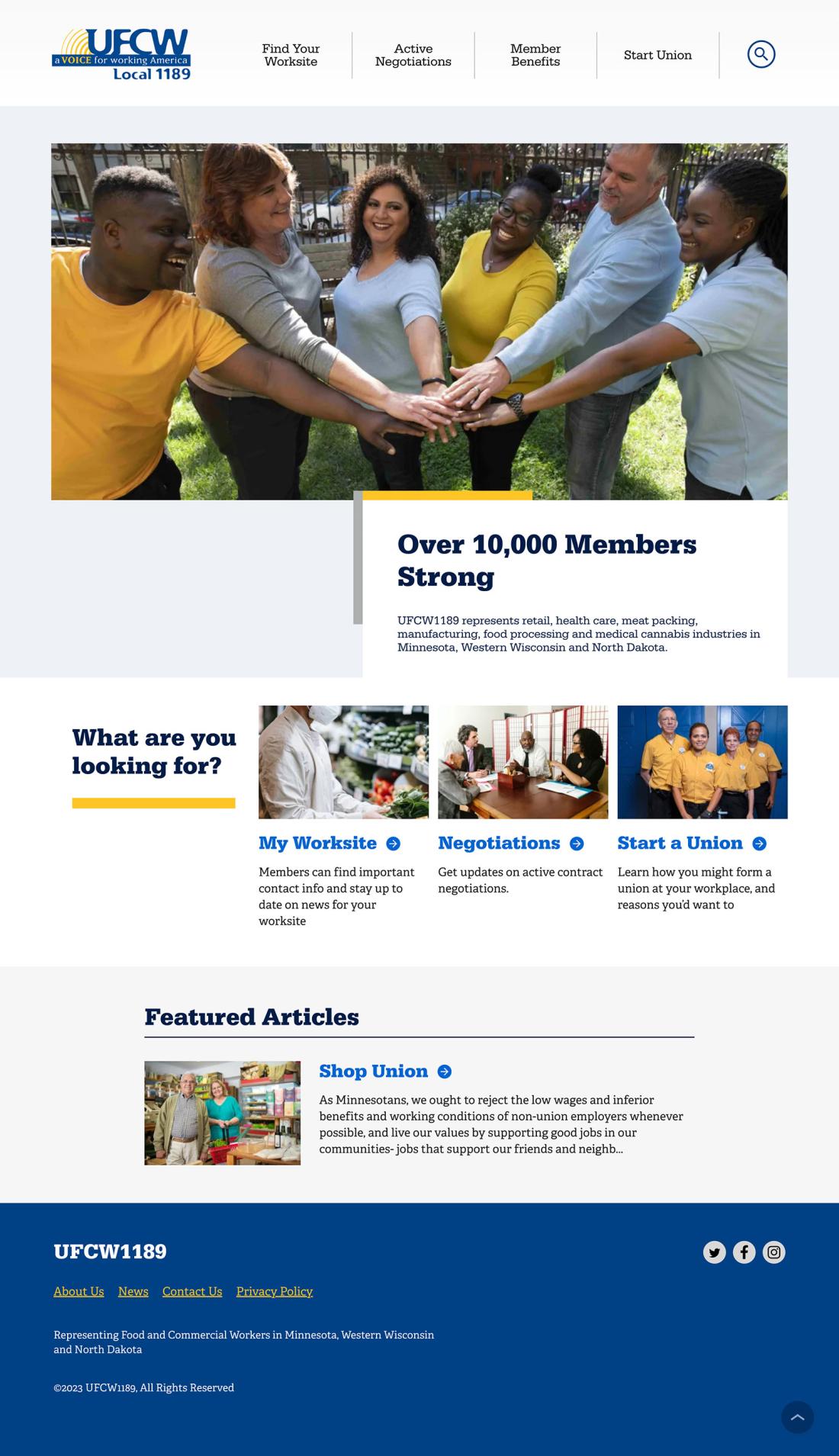
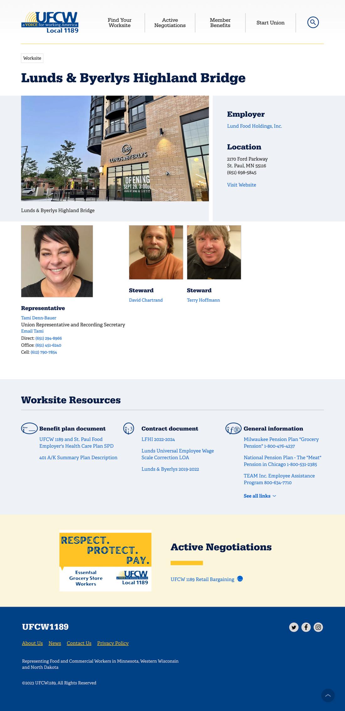
The primary purpose of the site is to help union members access information about their jobs. The most important task: finding their worksite and knowing who to contact. With that in mind, we redesigned the homepage to highlight three clear actions: Find a Worksite, Active Negotiations, and, for prospective organizers, Start a Union.
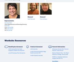
The worksite list remains table-based but now includes a simple keyword search to quickly filter results—replacing a set of confusing, redundant filters. For contract negotiations, we consolidated related updates onto each negotiation’s page and removed duplicate content.
Outdated campaign pages (formerly “Take Action!”) were replaced with a streamlined News section and moved to the footer, keeping the focus where members actually need it.
Simpler navigation, better UX
The old menu wasn’t long, but its labels were unclear. We updated navigation based on analytics and user intent, making small but meaningful adjustments:
- “Where You Work” → “Find Your Worksite”
- “Negotiate!” → “Active Negotiations”
- “Members Only” → “Member Benefits”
Clearer language helps members get where they need to go faster.
A more human design
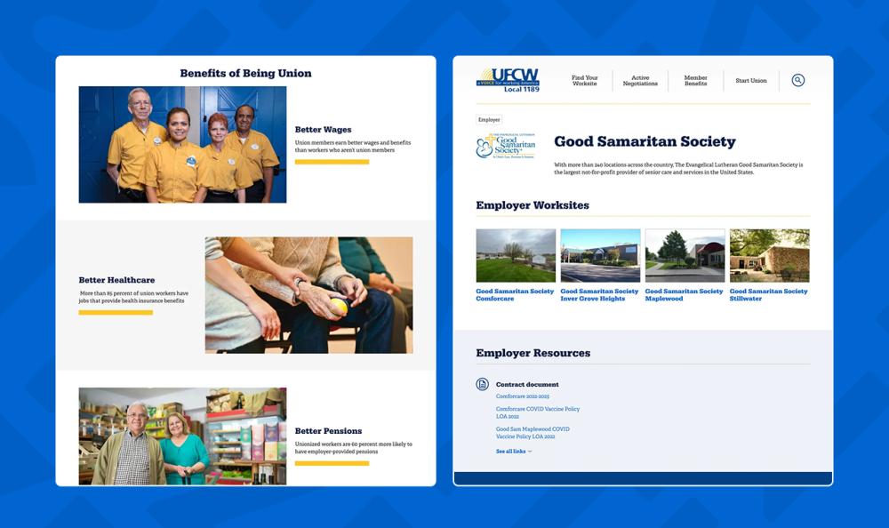
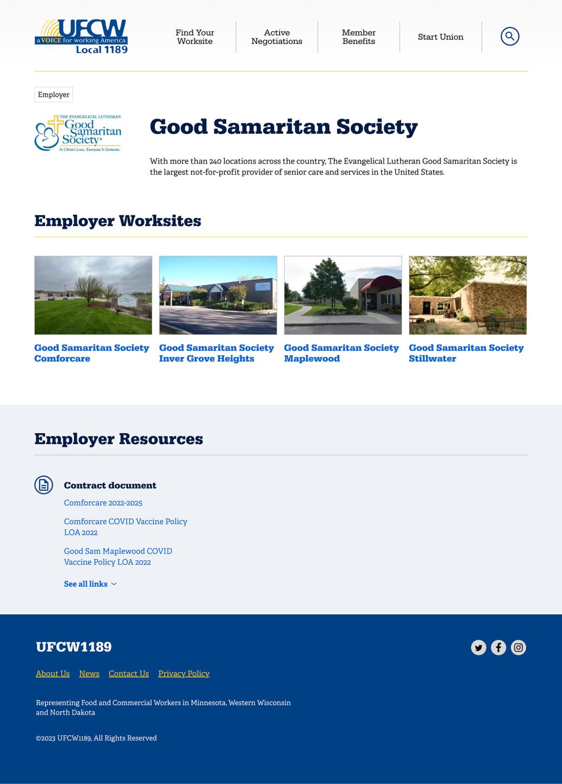
This is an organization built for people, so the design now reflects that. Each major landing page features prominent, easily updated images of members working, organizing, and negotiating—adding warmth and making the site feel more personal and engaging.
Smarter migration
Migrating from Drupal 7 to a newer version requires more than a technical upgrade. We performed a full content and module audit, removing unused structures, consolidating content types, and moving all media into Drupal’s core Media library. This ensured a cleaner, more maintainable site built on best practices.
During discovery, we also clarified audience needs, client goals, and success criteria. With branding already in place, we focused on refining tone, messaging, and the overall member-first experience.
