Content Strategy
A client with as broad of a mission as the Pollution Control Agency for the entire state of Minnesota had built up years of content online, but it was time to clean up and refocus the content to better serve state residents.
Our content strategy process began with an extensive audit and inventory, covering all the existing site's content. Tracking pages against analytics, we were able to identify content that was underperforming and lightly trafficked, as well as areas that hadn't been updated or touched for a long time.
We also ran several weeks of click tracking on the website, studying the behavior of site visitors–where they clicked, where they did not, when they scrolled, etc. Together with our content inventory, we started to get a picture of where to begin recommending changes.
Next, we conducted a series of stakeholder interviews to gain perspective and insight from key members of the client organization, and goals for the redesign. Through several content workshops, we then explored personas, audience, goals, and content criteria.
The end result of all of these exercises, workshops and research was summarized in a strategic brief, outlining our primary project goals–improving user paths, better telling MPCA's story to the world, increasing engagement, and making content management more sustainable.
Improved Sitemap
We spent time on our first steps getting to know our goals and audience, and how content could be edited, deleted or reorganized to be more effective. Now it was time to apply those lessons to the primary tool visitors use to find their way, and that is site navigation.
Our team spent an extensive amount of time exploring both how content could be reorganized in a new sitemap, and the specific terms and names used in navigation.
Once we had presented our findings to MPCA and made adjustments based on their feedback, we conducted a series of real-world user tests on how the new navigation performed. Through a series of testing, we gathered data on how well users understood the new organization–what worked and what needed further refinement.
By taking a careful, measured approach to our updates, we were able to deliver a more efficient and effective site navigation–one that was designed to better serve our project goals and improve user experience.
Design Improvements
Transitioning from content strategy and sitemap work, we then moved into the design stage. The MPCA team had a wide range of existing print materials and an existing brand to work from. Our job was to find a way to express and extend that brand to an online presence that was more engaging and focused.
Through a series of wireframes, we began by exploring what content to include on key pages of the site and how to visually prioritize the most important content for users. We looked at content from both a mobile and desktop perspective across the site.
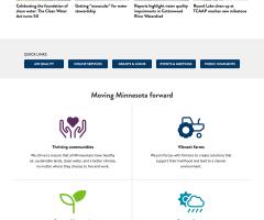
We generated a new design board where we explored how to more effectively apply brand colors and a new type system. We knew from our strategy work what content should be prioritized, and created a new family of icons to highlight the choices. Statistics and supporting quotations were added as new stylized components, designed to help break up content and emphasize key points while keeping pages readable.
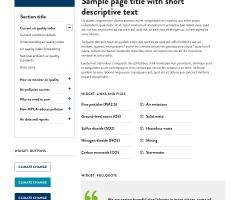
An entire system of design components was organized and shared with the client for use in the site rebuild.