Strategy
We started by defining and confirming our goals for the project, scheduling workshops and stakeholder engagements, and conducting competitive research. Our team held several technically-focused meetings with the client as well, in order to plan the new site build.
UX and IA Improvements
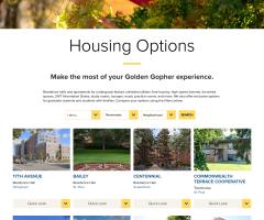
For the new site, we worked to simplify the menu. Only three primary selections are now presented to the end user (live here, community, and residents), and within each we’ve limited the number of subpages to 5 or 6.
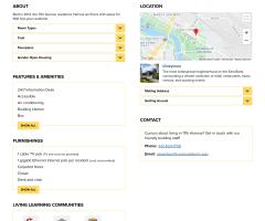
The page content itself makes greater use of whitespace, callouts and one or two primary “calls to action” to guide the user towards their destination.
The site content itself was changed to reflect a greater emphasis on “community” groups–where students select their on-campus housing based on like-minded groups or interests. These communities have a greater focus on both site structure, and while browsing information on resident halls or apartments.
Design and Branding
The website needed to be respectful of the University brand, and be part of the overall family of UMN sites. This meant use of a common university-wide header and footer, and common use of fonts and colors.
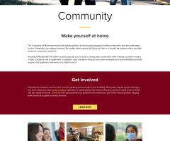
But beyond those foundations, the project was an opportunity to inject new life and energy to the site through a fresh new design. Our strategic direction was to simplify navigation and content presentation while engaging with new and current students.
We supported this direction through several design decisions. Page elements were arranged along a consistent grid, with generous use of whitespace. A new series of photos featuring students on campus became the primary focus for every landing page and throughout page content. On pages like residential halls, we carefully separated relevant content to allow for quick page scanning while hiding finer details until a user decided they wished to view additional content.
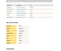
We followed a component-based approach to design, building out a unified system of components (buttons, accordions, tablets, tabs, navigation, etc.) prior to constructing any individual page layout or content type. Some components were initially defined in the university's design system and adapted from there, while others were new and needed to be made.