University Housing
University of Minnesota
Housing and Residential Life (“HRL” ) manages housing, meals, communities and safety for thousands of University of Minnesota students each year.
As the primary hub for so many incoming students, the website needs to be both an engaging experience and helpful resource. The site was last redesigned in 2016 and in need of full update and migration.
HRL originally worked with Electric Citizen ("EC") in 2016 to launch their previous site. They supplied the design mockups and our team worked to build out the site on the University’s new Drupal platform.
Building on that existing relationship, and with knowledge of EC’s experience in full-scale rebuilds for other clients, HRL engaged with EC to redesign their site and upgrade from Drupal 7 to Drupal 8. This time, EC was selected to not only do the migration and build, but also lead the discovery and design process.
While a majority of first year students select on-campus housing, privately-owned for-profit apartments are increasing in competition. The Housing site needed to stay up-to-date and relevant.

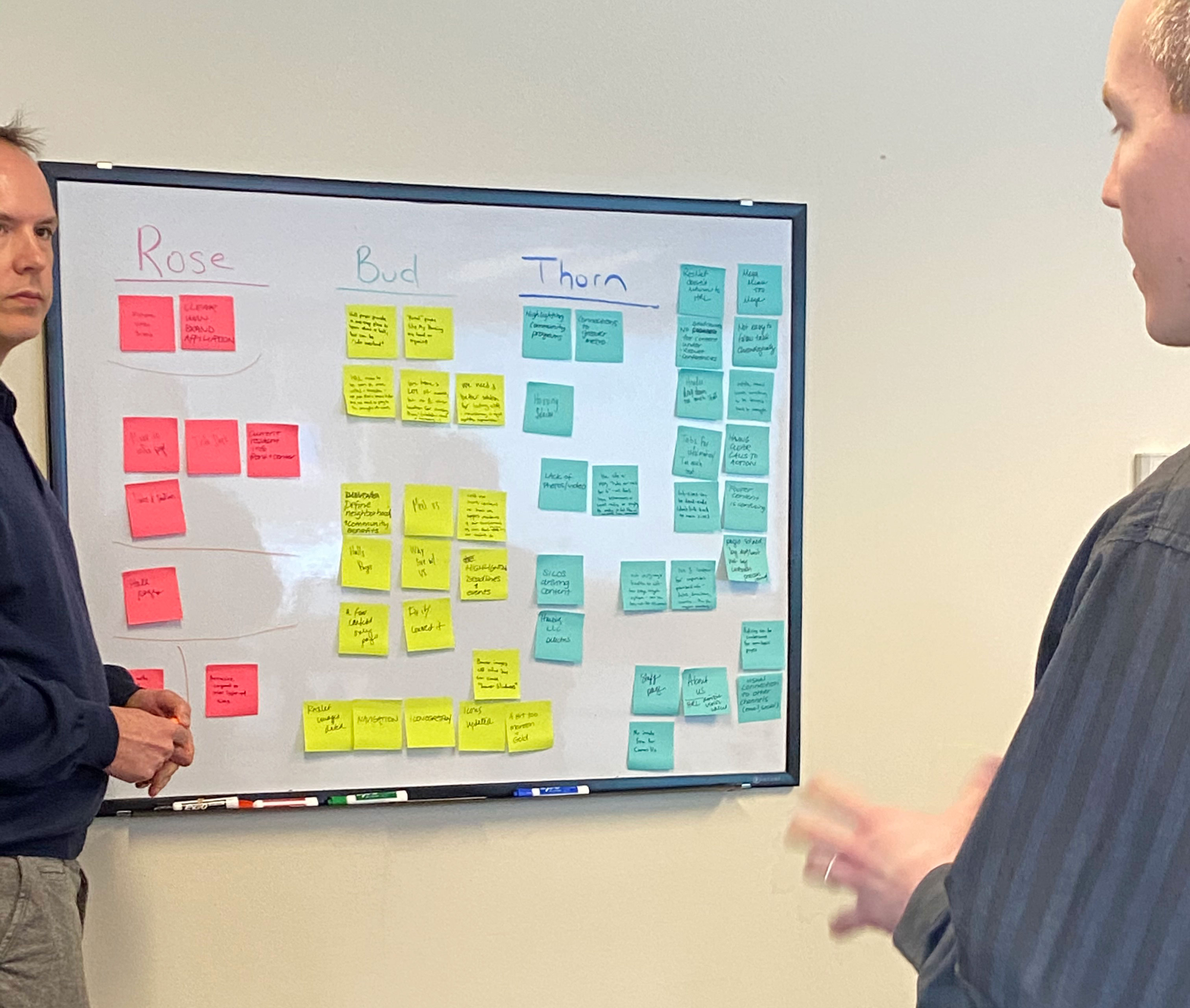
We started by defining and confirming our goals for the project, and how we could meet the challenge. We spent an afternoon hosting a discovery workshop, where both EC and HRL staff participated in a series of interactive exercises and conversations. Tasks included identifying our key stakeholders and their needs, and brainstorming solutions to issues we wished to resolve. We also researched and discussed a list of competitors, and lessons we could learn from others.
We completed our work with a well-defined strategic brief to guide us on future stages of the project.
Technical Architecture
Our team held several technically-focused meetings with the client as well, in order to plan the new site build. We reviewed current fields and content types, along with any existing features, and planned how these would be handled moving forward.
Challenges and Risk
The old site had grown too complex and content-heavy. The new site needed to provide easy access to useful information without overwhelming the user with choice. This meant a tighter defined navigation, pared down content on landing pages, and improved pathways for action and results.

The old site featured a very lengthy mega menu for navigation. Some menu items had well over a dozen selections in a dropdown menu, making it difficult to make quick decisions. Content was sometimes organized by internal business structures, and less by student concerns.
For the new site, we worked to simplify the menu. Only three primary selections are now presented to the end user (live here, community, and residents), and within each we’ve limited the number of subpages to 5 or 6.
The page content itself makes greater use of whitespace, callouts and one or two primary “calls to action” to guide the user towards their destination.
The site content itself was changed to reflect a greater emphasis on “community” groups–where students select their on-campus housing based on like-minded groups or interests. These communities have greater focus in both site structure, and while browsing information on resident halls or apartments.


Both the old and new site needed to be respectful of the University brand, and be part of the overall family of UMN sites. This meant use of a common university-wide header and footer, and common use of fonts and colors.
But beyond those foundations, the project was an opportunity to inject new life and energy to the site through a fresh new design. Our strategic direction was to simplify navigation and content presentation while engaging with new and current students.
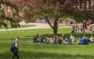
We supported this direction through several design decisions. Page elements were arranged along a consistent grid, with generous use of whitespace. A new series of photos featuring students on campus became the primary focus for every landing page and throughout page content. On pages like residential halls, we carefully separated relevant content to allow for quick page scanning while hiding finer details until a user decided they wished to view additional content.
We followed a component-based approach to design, building out a unified system of components (buttons, accordions, tablets, tabs, navigation, etc.) prior to constructing any individual page layout or content type. Some components were initially defined in the University's design system and adapted from there, while others were new and needed to be made.
The end result is a quick loading, fresh and friendly interface, with easy to understand selections and pathways for students to find the information they need, and raise interest in attending the university.

One of the primary goals of visitors to the site is to review their housing options and try to make a decision on where to live. We redesigned the housing selector to make this process easier.
The landing page displays a grid of options, with a short set of filters to search by specific criteria (neighborhood, student status, number of roommates). We deliberately kept the number of filters low to cut down on the number of distractions as users browse the page. A new “quick look” option puts some key details about each building easily accessible (cost, communities) while again reducing the information overload on initial page load.
Clicking through to view an individual building, information was redesigned to again emphasize a clean, fast-loading and well-organized page. Data is grouped into easily understandable categories, with the highest priority items listed first (location, features, etc.). For longer sets of data, such as “furnishings”, we opted to only show the first 5, but allow the user to expand the full set of details if they so desire.
A new set of photos for each building are prominently featured and tell as good a story about the living experience as any words could do.

The Covid pandemic had a great impact on higher ed and campus housing, as universities dealt with safety concerns, and students were sent home during campus shutdowns. Understandably the launch of the site was greatly delayed as staff dealt with more pressing issues. But through patience and preservation, we were able to launch the new site in 2021.
As we hopefully await a return to a full complement of students living on campus in the fall, the new Housing site will help students and their families find the housing they need and the communities they desire.
The new site is fully accessible, fast-loading and offers a new and improved experience for everyone. All pages are responsive and mobile-ready, and meet the accessibility standards of WCAG 2.0. Several months after launch, we are working to upgrade the site to Drupal 9.


