MassLegalHelp
Massachusetts Legal Assistance
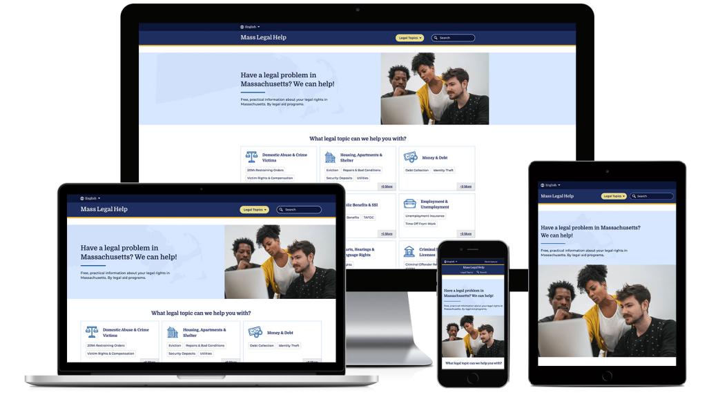
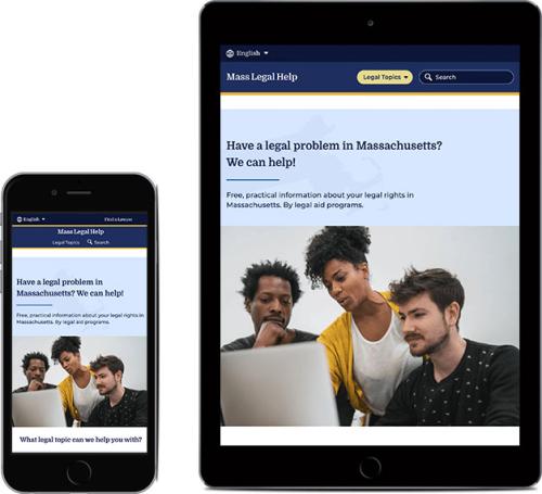
MassLegalHelp is a free, statewide resource for Massachusetts' residents.
The website is organized around a dozen legal topics, each with its own helpful series of articles, guides, links and documents. Visitors can use the site to do their own research, as well as get connected with helpful third party organizations or a lawyer.
One of the primary funders for the website is the Massachusetts Legal Assistance Corporation ("MLAC").
Our team had already successfully conducted redesigns for LawHelpMN and MontanaLawHelp, and was selected by MLAC to rebuild the MassLegalHelp website.
The website for Massachusetts Legal Help was dated and confusing. The design itself was not accessible, content only available in English, and included a clunky user interface that was difficult to manage.
After working on initial new designs, the MLAC team sought a new partner to help with additional design consulting, a full migration and rebuild, and ongoing support.
Our first step was to work on some additional page layouts to address some gaps in the process, while planning a migration from the old website to the newest version of their CMS (Drupal). We also conducted a technical analysis and drafted a build plan for the site before moving into production.
The new site needed to include a number of new features for presenting content, including the use of accordions and tabs to make vast amounts of content more manageable.
Using taxonomy and tagging, we organized content into categories while providing users with a variety of additional tools for “filtering" results to their individual needs.
Chapter-based eBooks were generated to handle long, heavily detailed legal guides, while on-page feedback tools allow users to quickly communicate to the client if the page content is useful for their needs.

As we moved from design to production, it was time to test how users would navigate the redesigned site.
Working from a script we developed in partnership with the client, we held a series of remotely-conducted user interviews, asking questions and recording observations as they attempted to conduct a series of tasks on the website.
Because of the intended audience for the site, we did two rounds of user testing. The first was in English, while the second was conducted entirely in Spanish.
Based on the results of testing, we then drafted a series of recommended changes and improvements to the site, all in the name of improving the user experience. Our team began implementing changes prior to launch, and continue to do post-launch, as part of our ongoing support.


